

Why Experts Say These Paint Colours Are Falling Off and What To Use Instead
Top design professionals reveal the hues they’d never use, and why certain colours can undermine a space.
Choosing the right paint colour can make or break a room, but according to leading designers, some colours are best left off the palette. During a panel discussion with House Beautiful, designers Nate Berkus, Sasha Bikoff, Olivia Song and Rayman Boozer shared which paint colours they absolutely avoid, and the reasons may surprise you.
Grey (especially “millennial grey”)

Designer Sasha Bikoff admits she’s done with grey: “I just don’t like a gloomy, sad, dark grey… When it’s grey and gloomy, I wouldn’t want to have that in my room or anything.”
Olivia Song echoes the sentiment: “I actually hate millennial grey — and all things gray scale,” adding that these shades “have no definition or personality.”
The takeaway? Grey may feel safe or versatile, but if it nudges toward “gloom,” it may undermine a space’s vitality.
Orange

Nate Berkus is blunt: “I have a visceral reaction to it. I can’t even look at it… I hate it so much that even when it’s present in an abstract painting, I stop… I think it’s hideous.”
His strong stance suggests that while bold colours can make a statement, orange carries heavy emotional baggage, and for him, it’s a hard pass.
Red (as a dominant wall colour)
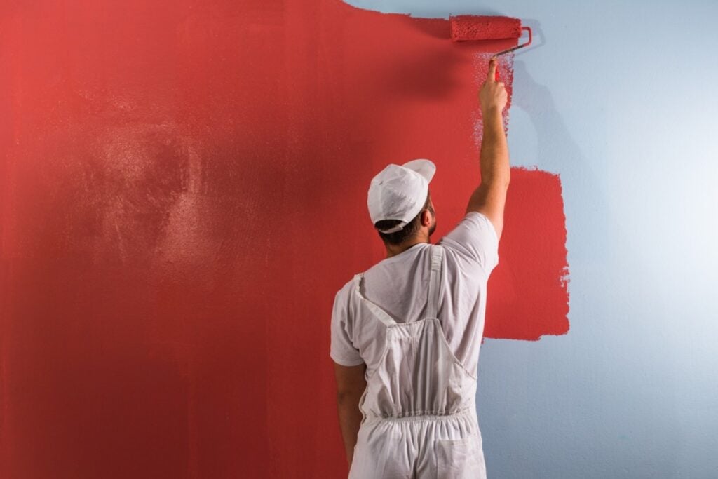
Rayman Boozer doesn’t despise red — but he warns it’s a tricky colour to control: “It’s a hard color for me. I can only take it in small doses … I try to avoid it.”
He adds that even his experience with what he considers a strong red for a dining room conveys the challenge: though he painted a room in Benjamin Moore “Million Dollar Red” for a client, he says he’d never do it again. House Beautiful
Red may evoke energy or passion, but when used full-scale on walls, it can overwhelm a space or limit décor flexibility.
What This Means for Your Home (and What to Do Instead)

Think about mood first. Colours may look great on a swatch, but how do they feel when the lights are on, the day is grey, or the evening shades fall? As Bikoff points out, if a colour is “gloomy,” it can dominate a space.
Be wary of the neutral trap. Grey and near-white tones seem safe, but if they lack warmth or definition, they can make a room feel flat or lifeless — something Song warns against.
Use bold colours strategically. If you love orange or red, consider them as accents: one wall, a piece of furniture, or a decorative element — rather than a full-room hue. Boozer’s warning is clear: large expanses of red are less forgiving.
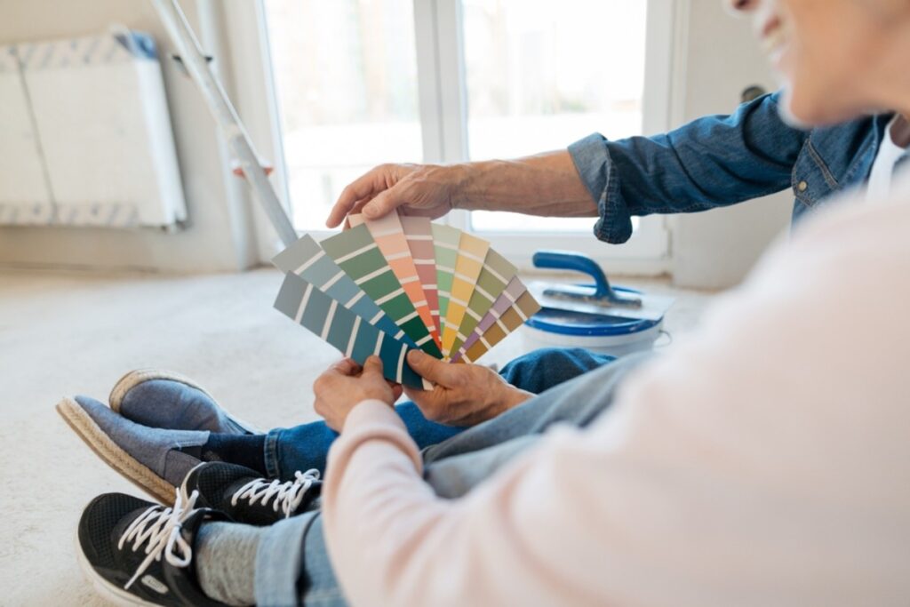
Test the paint at home. Always apply large swatches on different walls, observe them at various times of day, and with your lighting. Designers are reacting to how colour feels, not merely how it looks in isolation.
Consider the big picture. Paint colour interacts with furniture, flooring, lighting, and even architectural elements. A hue you hate might work if it complements surroundings — but if you’re already predisposed to dislike it (like orange for Berkus), it probably won’t feel right.
While there are no absolutely “forbidden” colours in design, the insights from these industry professionals reveal that some hues are riskier than others — especially when they conflict with mood, space, or personal style. By listening to what designers truly dislike, you can refine your palette and make safer, more satisfying choices in your home.
Designer-Approved Colours to Try Instead
Muted greens. One survey found muted green shades to be the standout choice among designers. These greens act like a “new neutral”, calming, versatile and more interesting than grey. The Spruce
Example shades: Farrow & Ball “Arsenic No. 214” or Benjamin Moore “Mediterranean Olive.”
Rich neutrals with depth. Designers are turning away from flat greys and off-whites and embracing neutrals with tonal complexity: earthy browns, taupes, warm beiges, and even subtle mauves. House Beautiful
Example shades: Benjamin Moore “Revere Pewter HC-172” (warm grey) or Farrow & Ball “Broccoli Brown” (deep warm brown) as mentioned by designer Ashi Waliany. House Beautiful
Entire room walls for a cozy base, or as accent walls that let furnishings pop.
Charcoal, soft black & deep colours. If you love drama, a near-black or deep charcoal is more forgiving than pure black, and designer-approved for adding depth and sophistication. Homes and Gardens+1
Example shades: Sherwin-Williams “Iron Ore” or Benjamin Moore “Gray 2121-10” (soft black).
Feature walls, millwork, or ceilings in spaces with good natural light.
Warm white & off-white (properly done). Pure white can feel cold; designers recommend warm whites or off-whites with subtle undertones that adapt gracefully to different lighting. House Beautiful
Example shade: Sherwin-Williams “Snowbound SW 7004” or Benjamin Moore “Moonlight White OC-125.”
Entire room canvases where you want versatile décor layering and a bright but not glaring backdrop.